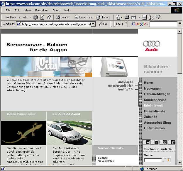
Audi.com, the first partially “responsive” website in 2001
Audi.com, the first partially “responsive” website
2001 December
The website designed for Audi by the Razorfish digital agency was one of the first to modify its content based on the size of the web browser window. Audi.com was “optimized” for 640×480 px, 800×600 px and 1024×768 px. However, Audi.com was not a classic example of responsive web design as we know it today, but rather a dynamic customization of design using JavaScript, based on a detection of browser resolution.
